
Abstract
Dataset
National Institutes of Health Chest X-Ray Dataset Chest X-ray exams are one of the most frequent and cost-effective medical imaging examinations available. However, clinical diagnosis of a chest X-ray can be challenging and sometimes more difficult than diagnosis via chest CT imaging. The lack of large publicly available datasets with annotations means it is still very difficult, if not impossible, to achieve clinically relevant computer-aided detection and diagnosis (CAD) in real world medical sites with chest X-rays. One major hurdle in creating large X-ray image datasets is the lack resources for labeling so many images. Prior to the release of this dataset, Openi was the largest publicly available source of chest X-ray images with 4,143 images available.
This NIH Chest X-ray Dataset is comprised of 112,120 X-ray images with disease labels from 30,805 unique patients. To create these labels, the authors used Natural Language Processing to text-mine disease classifications from the associated radiological reports. The labels are expected to be >90% accurate and suitable for weakly-supervised learning. The original radiology reports are not publicly available but you can find more details on the labeling process in this Open Access paper: “ChestX-ray8: Hospital-scale Chest X-ray Database and Benchmarks on Weakly-Supervised Classification and Localization of Common Thorax Diseases.” (Wang et al.)
Problem Statement
analyze data from the NIH Chest X-ray Dataset and train a CNN to classify a given chest x-ray for the presence or absence of pneumonia.
This project will culminate in a model that can predict the presence of pneumonia with human radiologist-level accuracy that can be prepared for submission to the FDA for 510(k) clearance as software as a medical device.
Metrics
AUC
AUC is used for binary classification, multiclass classification, and ranking problems. AUC measures the proportion of correctly ordered objects and the capability of the model to distinguish between the classes.
The AUC has an important statistical property: the AUC of a classifier is equivalent to the probability that the classifier will rank a randomly chosen positive instance higher than a randomly chosen negative instance.
AUC is the Area Under the ROC Curve. The best AUC = 1 for a model that ranks all the objects right (all objects with class 1 are assigned higher probabilities then objects of class 0). AUC for the ‘bad’ classifier which is working as random guessing is equal to 0.5.
The ROC curve shows the model’s ability to distinguishing between classes.
The model which randomly assigns a class to object is a ‘bad’ classifier and has a diagonal ROC curve. The better is the classifier, the higher is the ROC curve. The ROC curve is plotted with TPR, True Positive Rate, on the y-axis against the FPR, False Positive Rate, on the x-axis. The curve also could be interpreted in terms of Sensitivity and Specificity of the model with Sensitivity on the y-axis and (1-Specificity) on the x-axis.
Building and visualizing the ROC curve could be used to measure classification algorithm performance with different probability boundaries and select the probability boundary required to achieve the specified false-positive or false-negative rate.
Binary Accuracy
Binary Accuracy calculates the percentage of predicted values (yPred) that match with actual values (yTrue) for binary labels.
Since the label is binary, yPred consists of the probability value of the predictions being equal to 1.
For a record:
- If the probability is above the threshold, 1 is assigned else the value assigned is 0.
- If the assigned value is equal to the actual value, it is considered accurate.
We then calculate Binary Accuracy by dividing the number of accurately predicted records by the total number of records.
The threshold (default = 0.5) can be adjusted to improve Binary Accuracy.
EDA
DataFrame.describe() method generates descriptive statistics that summarize the central tendency, dispersion and shape of a dataset’s distribution, excluding NaN values. This method tells us a lot of things about a dataset. One important thing is that the describe() method deals only with numeric values. It doesn’t work with any categorical values. So if there are any categorical values in a column the describe() method will ignore it and display summary for the other columns unless parameter include=“all” is passed.
- count tells us the number of Non-empty rows in a feature.
- mean tells us the mean value of that feature.
- std tells us the Standard Deviation Value of that feature.
- min tells us the minimum value of that feature.
- 25%, 50%, and 75% are the percentile/quartile of each features. This quartile information helps us to detect Outliers.
- max tells us the maximum value of that feature.
all_xray_df.describe()

               count    mean      std       min   25%    50%   75%    max
Follow-up #   112120.0  8.573751  15.406320 0.000 0.000 3.000 10.000  183.0000
Patient ID    112120.0  14346.381743  8403.876972 1.000 7310.750  13993.000 20673.000 30805.0000
Patient Age 112120.0  46.901463 16.839923 1.000 35.000  49.000  59.000  414.0000
OriginalImage[Width 112120.0  2646.078844 341.246429  1143.000  2500.000  2518.000  2992.000  3827.0000
Height] 112120.0  2486.438842 401.268227  966.000 2048.000  2544.000  2991.000  4715.0000
OriginalImagePixelSpacing[x 112120.0  0.155649  0.016174  0.115 0.143 0.143 0.168 0.1988
y]  112120.0  0.155649  0.016174  0.115 0.143 0.143 0.168 0.1988
Unnamed: 11 0.0 NaN NaN NaN NaN NaN NaN NaN
EDA Visualization
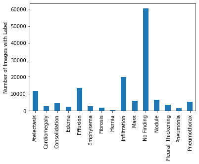
The relative frequencies of each disease in dataset. It looks like ‘No Finding’ is the most common occurrence. ‘No Finding’ can never appear with any other label by definition, so we know that in 57.5% of this dataset, there is no finding in the image. Beyond that, it appears that ‘Infiltration’ is the most common disease-related label, and it is followed by ‘Effusion’ and ‘Atelectasis.
Age and Gender distribution
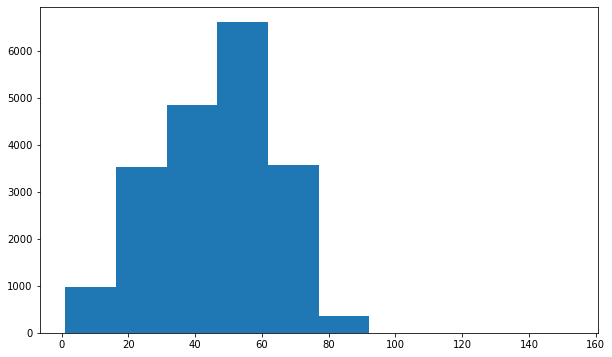
Looks like the distribution of age across the whole population is slightly different than it is specifically for Infiltration and Effusion. Infiltration appears to be more skewed towards younger individuals, and Effusion spans the age range but has a large peak around 55.
Implementation
Spliting data
Data was splitted for training and validation.
def create_splits(vargs):


    pmonia_df = all_xray_df[all_xray_df['Pneumonia'] == 1]
    non_pmonia_df = all_xray_df[all_xray_df['Pneumonia'] == 0]
    train_data, val_data = skl.train_test_split(pmonia_df, test_size = 0.2)
    train_non_pmonia_data, val_non_pmonia_data = skl.train_test_split(non_pmonia_df, test_size = 0.5)
    train_non_pmonia_data = train_non_pmonia_data.sample(train_data.shape[0])
    train_data = pd.concat([train_data, train_non_pmonia_data])
    non_pmonia_test_count = int((val_data.shape[0] / 1.2) * 98.8)
    val_non_pmonia_data = val_non_pmonia_data.sample(non_pmonia_test_count)
    val_data = pd.concat([val_data, val_non_pmonia_data])

    return train_data, val_data

train_df, valid_df = create_splits(all_xray_df)
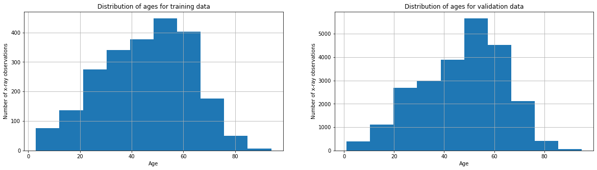
Age distribution accross the training data and validation data
fig, axes = plt.subplots(1, 2)
train_df['Patient Age'].hist(ax=axes[0],figsize=(20,5))
valid_df['Patient Age'].hist(ax=axes[1],figsize=(20,5))
axes[0].set_title('Distribution of ages for training data')
axes[0].set_xlabel("Age")
axes[0].set_ylabel("Number of x-ray observations")
axes[1].set_title('Distribution of ages for validation data')
axes[1].set_xlabel("Age")
axes[1].set_ylabel("Number of x-ray observations")
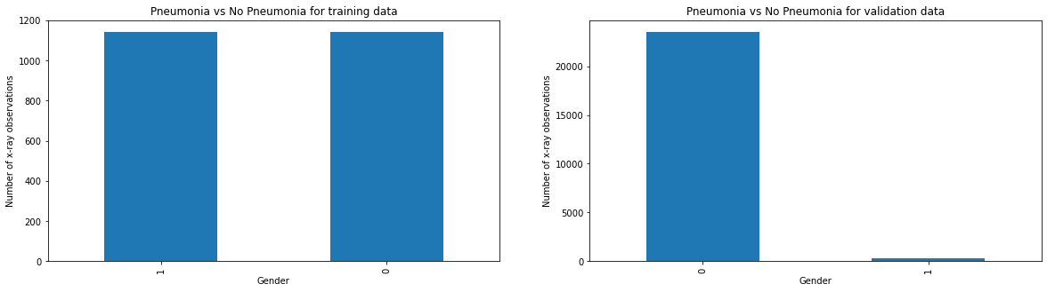
Compare Pneumonia vs No Pneumonia cases between training vs validation data
fig, axes = plt.subplots(1, 2)
train_df['Pneumonia'].value_counts().plot(ax=axes[0],kind='bar',figsize=(20,5))
valid_df['Pneumonia'].value_counts().plot(ax=axes[1],kind='bar',figsize=(20,5))
axes[0].set_title('Pneumonia vs No Pneumonia for training data')
axes[0].set_xlabel("Gender")
axes[0].set_ylabel("Number of x-ray observations")
axes[1].set_title('Pneumonia vs No Pneumonia for validation data')
axes[1].set_xlabel("Gender")
axes[1].set_ylabel("Number of x-ray observations")
Algorithms and Techniques
Training
This classification problem as well it requires transfar learning hence vgg16 was used.
def build_my_model():

    model = Sequential()
    model.add(load_pretrained_model())
    model.add(Flatten())
    model.add(Dropout(0.5))
    model.add(Dense(1024, activation='relu'))
    model.add(Dropout(0.5))
    model.add(Dense(512, activation='relu'))
    model.add(Dropout(0.5))
    model.add(Dense(256, activation='relu'))
    model.add(Dropout(0.5))
    model.add(Dense(1, activation='sigmoid'))
    model.compile(optimizer = Adam(lr=1e-4), loss='binary_crossentropy', metrics=['binary_accuracy'])


    return model
my_model = build_my_model()
history = my_model.fit_generator(train_gen,
                           validation_data = (valX, valY),
                           epochs = 15,
                           callbacks = callbacks_list)
Model Evaluation
def plot_auc(valY, pred_Y):

    precision, recall, thresholds = precision_recall_curve(valY, pred_Y)

    # Todo
    fpr, tpr, _ = roc_curve(valY, pred_Y)
    roc_auc = auc(fpr, tpr)

    # Calculate f1 vs threshold scores
    f1_scores = []
    for i in thresholds:
        f1 = f1_score(valY.astype(int), binarize(pred_Y,i))
        f1_scores.append(f1)


    # Plot charts
    fig, (ax1, ax2, ax3) = plt.subplots(1, 3, figsize=(20,5))

    lw = 2
    ax1.plot(fpr, tpr, color='purple', lw=lw, label='ROC curve (area = %0.4f)' % roc_auc)
    ax1.plot([0, 1], [0, 1], color='navy', lw=lw, linestyle='--')
    ax1.set_xlabel('False Positive Rate')
    ax1.set_ylabel('True Positive Rate')
    ax1.title.set_text('ROC Curve')
    ax1.legend(loc="upper left")
    ax1.grid(True)

    ax2.step(recall, precision, color='red', where='post')
    ax2.set_xlabel('Recall')
    ax2.set_ylabel('Precision')
    ax2.title.set_text('Precision-Recall Curve')
    ax2.grid(True)

    ax3.plot(thresholds, f1_scores, label = 'F1 Score', color='purple')
    ax3.set_xlabel('Threshold')
    ax3.set_ylabel('F1 Score')
    ax3.title.set_text('F1 Score vs Threshold')
    ax3.legend(loc="upper left")
    ax3.grid(True)

    plt.show()
    return

plot_auc(valY, pred_Y)
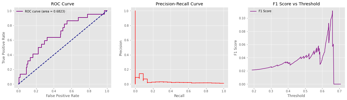
The AUC suggests an 69% chance that the radiologist reading the image will correctly distinguish a normal from pneumonia to non pneumoninia patient based on the ordering of the image ratings
Classification report:
              precision    recall  f1-score   support

         0.0       0.99      1.00      0.99      1978
         1.0       0.00      0.00      0.00        22

    accuracy                           0.99      2000
   macro avg       0.49      0.50      0.50      2000
weighted avg       0.98      0.99      0.98      2000